Honda Confirms New Logo
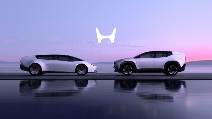
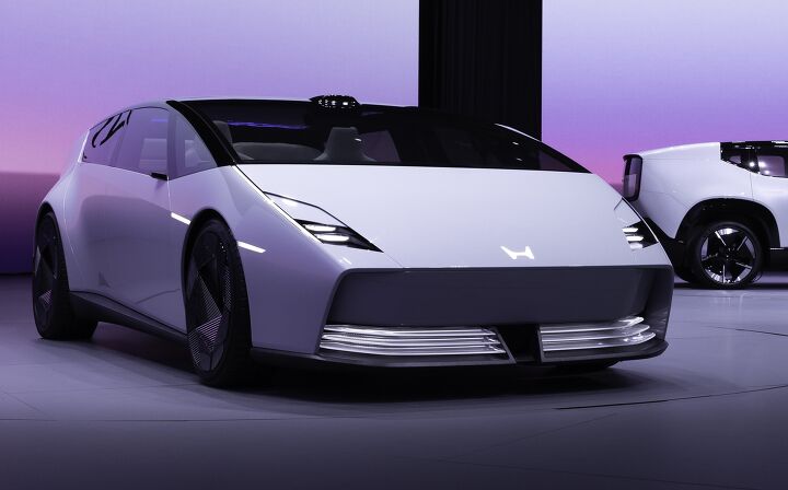
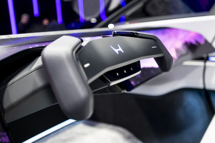
Honda has announced that the logo which originally debuted on its 0 Series EV concepts will gradually become the brand’s primary emblem.
As initially promoted, the updated logo will first appear on the company’s all-electric products. But it’s apparently not staying there. Instead, it’ll slowly be embraced by the entire Honda lineup. The company said you can eventually expect to see it used for external communications, motorsports, and to identify dealership locations.
The symbol borrows from past Honda logos, growing wider and abandoning the border of the current emblem.
Corporate iconography always evolves. However, plenty of automakers have been on a bit of a redesign kick of late. While your author can only speculate as to why, the most likely answers include wanting attention and an attempt to redefine themselves. For whatever reason, loads of manufacturers are trying to rebrand themselves as tech companies. This is despite technology firms growing increasingly unpopular with the general public.
Honda originally attached the updated logo to its all-electric vehicles, saying it would be "exclusive" to those models. But that is no longer the case.
This is something we've seen before. Several automakers initially tried to create unique branding for their EV division. However, the new trend is to incorporate them into the core lineup while borrowing whatever design trends leadership thinks will work.
Other companies just seem to be updating their emblems for the heck of it. Changes to Porsche’s logo were so subtle that you probably didn’t even notice that it had been updated. However, Kia’s updates were so aggressive that I’ve had people ask me to identify models because they thought its new products came from some entirely novel brand.
Kia has a long history of aggressively updating its emblem. But General Motors does not, making its current logo rather bewildering. The original embossed and underlined iconography evoked a sense of power and pressed steel. You had the sense that “GM” was an industrial force to be reckoned with. By contrast, the current logo uses lower-case letters and a softer blue hue — allegedly done to evoke a sense of friendliness as the company pivoted toward an “all-electric future.”
It’s absolutely terrible.
Honda’s new design is much more palatable and borrows directly from heritage designs. You can clearly see the influence from the emblems its automotive division used prior to 1981. Honda Motorcycles typically ran with a wing with the company’s name spelled out underneath, whereas its small engine and marine divisions just used the name.
It’s not clear if the new automotive logo will be adopted by other Honda divisions. But it seems unlikely at this juncture. It also seems probable that the default font the company has used for its name since 1961 will persist across the board.
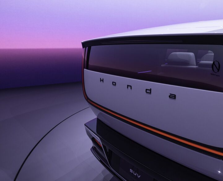
However, the Series 0 concept vehicles actually do use a different font to spell out the brand name in full and even uses some lower-case lettering. We suppose a complete changeover is possible. It just hasn't been confirmed.
If there’s anything to complain about, the new H does kind of look like a W. But that’s how it was back in the 1970s, too. I’m likewise not in love with the flat designs that are currently popular. My guess is that this is because a lot of automakers think illuminated emblems are the new hotness — rather than something that is going to look immediately tacky and dated.
We’ve tried illuminated emblems before (e.g. Pontiac and Mercury). A lot of them burned out prematurely, resulting in maintenance headaches. While modern LEDs should help them last a bit longer than their predecessors, they still seem like a gauche fad. But that’s a matter of taste and not something one can point to as any kind of objective failure. Enough people seem to be buying them for automakers to have stuck with the concept.
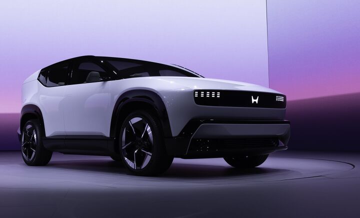
I kind of like the updated Honda logo. But it does feel wildly unnecessary, especially considering what’s happening within the industry at large. Manufacturers really do seem to have forgotten the fundamentals on delivering the kind of products that resonate with the public. Enthusiasts are desperate for more mechanical vehicles with any amount of personality. Meanwhile, just about everyone wants to see an influx of affordable models that do away with a lot of the gimmicky tech that encourages elevated MSRPs.
Launching a new logo is fine. But it’s probably not something that was on the top customers’ wish list, regardless of their preferred automotive brand.

[Images: Honda]
Become a TTAC insider. Get the latest news, features, TTAC takes, and everything else that gets to the truth about cars first by subscribing to our newsletter.
from TheTruthAboutCars https://ift.tt/Y6jKVmv
via IFTTT
No comments